Healthcare Design System in Action
Leading UX/UI execution, design system adoption, and cross-team alignment across 18+ responsive pharma websites

the problem
Our client needed the redesign of its US market websites under a shared design system. Each site had different content, stakeholders, and regulatory constraints, making it difficult to maintain consistency, usability, and alignment across multiple teams and agencies. The challenge wasn’t just visual, it was about turning a global system into scalable, real-world experiences without creating fragmentation or inefficiencies.
the approach
I bridged the gap between the design system and implementation by leading UX/UI design across sites, guiding internal teams and external agencies as a design system consultant, and acting as the main point of contact between design, development, and the system team. Along the way, I created reusable templates, improved usability where possible, and fed real-world insights back into the design system, strengthening both the websites and the system itself.
My role extended beyond interface design. I acted as a senior UX/UI designer, design system consultant, and primary point of contact, ensuring consistency, usability, and alignment across internal teams, external agencies, and developers.
This was a redesign at scale.
Multiple sites.
Multiple teams.
One design system.
The work required balancing global consistency with local flexibility, while keeping experiences usable, compliant, and visually cohesive.
First, some quick context:
About My Team
A cross-functional production team dedicated to delivering high-quality, compliant digital assets for pharmaceutical brands at scale.
It includes designers, developers, QA specialists, and strategists working together to ensure efficiency, consistency, and regulatory accuracy across multiple projects.
About the Design System
Designed for the pharmaceutical industry, this design system balances strict regulatory compliance with accessibility and usability. It enables scalable, consistent experiences across multiple company websites, reducing production time while ensuring cohesion and quality. As a living system, it is continuously enhanced to support evolving needs and maintain high standards across all digital touchpoints.
It includes:
Pre-approved, compliant UI components
Responsive page templates
Defined typography & color standards
Regulated imagery & content rules
Accessible interaction patterns (WCAG-aligned)
Clear usage & implementation guidelines
It ensures:
Consistency, compliance, scalability, and faster delivery across all brand sites.
My Main Roles Within the Projects:
Senior UX/UI Design
I translate the existing design system into real, production-ready experiences across desktop and mobile. Redesigning UI for clarity and consistency, improving content hierarchy and ensuring responsive and accessible behavior.
Design System Consultant
I support internal teams and external agencies in applying the design system correctly. I clarify component and pattern usage, guide teams through complex design scenarios and help maintain consistency across parallel workstreams.
Point of Contact
I act as the central design connector across teams. I distribute design tasks within my team, align closely with developers during handoff, run cross-functional meetings, and represent real implementation needs to the design system team.
Working across many sites exposes gaps and edge cases in the design system. I bring these insights into weekly system meetings, suggesting enhancements and helping evolve components based on real implementation needs.
_______________
Now, a quick glance of our projects with an example of each case depending on my role:
Case 1: HCP Site
End-to-End Design Process Lead
Process I lead:

How I Lead the Process:
Strategic Site Audit
I lead a structured evaluation of the existing site to define scope, detect system gaps, and anticipate compliance risks.
Asset Alignment & Foundation Setup
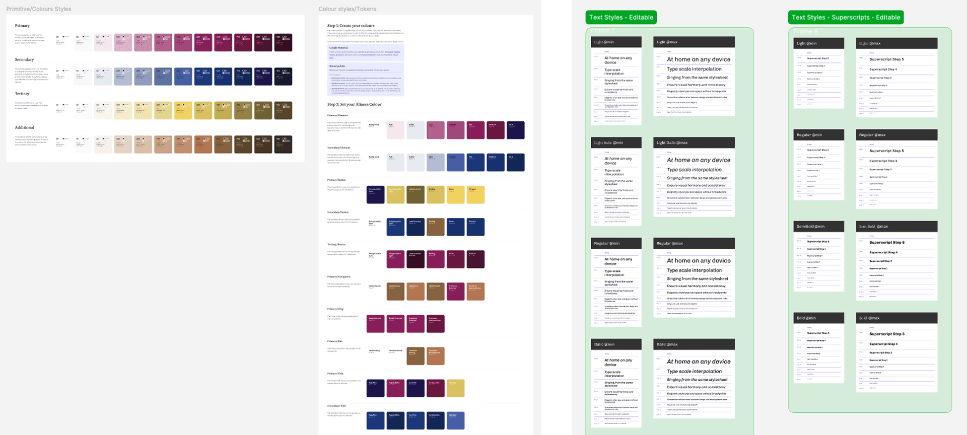
I coordinate asset collection, validate content and imagery constraints, and ensure regulatory and brand alignment from the outset. I establish compliant typography (Google Fonts), color systems, and Figma libraries, activating the design system foundations for the project.
Color palette and typography library setup:
Information Architecture & Layout Strategy
We define the page structure, section hierarchy, and component strategy, ensuring scalability, usability, and strict adherence to the approved design system.
Design Direction (Desktop → Mobile)
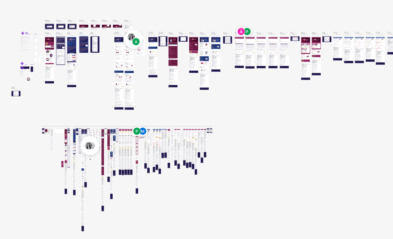
I drive the desktop-first UI direction while guiding and mentoring the collaborating designer, distributing tasks and ensuring clarity, accessibility, and interaction consistency, then lead responsive adaptations for mobile.
Compliance & Internal Validation
I conduct internal reviews to ensure correct component usage, accessibility alignment, and regulatory readiness before stakeholder exposure.
Stakeholder Alignment & Iteration
I lead presentations to brand, agency and development, managing feedback integration while protecting UX and system integrity.
Medical Approval Process (MAP) Validation
I oversee submission for formal medical and regulatory review, ensuring risk disclosure compliance, and pharmaceutical standards adherence.
Developer Handoff & Implementation Support
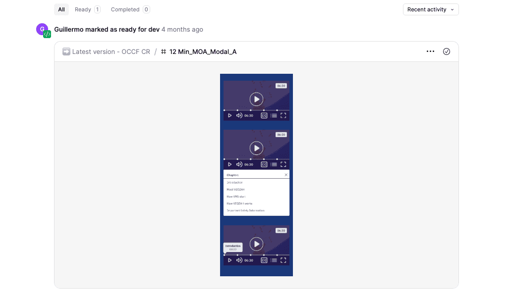
I lead the handoff process, providing annotated files, structured Figma access, asset organization, and ongoing guidance to development and QA teams.
Quality Assurance & Launch Oversight
I supervise final QA validation for functionality, responsiveness, and consistency, ensuring the site meets system, regulatory, and brand standards before deployment.
_______________
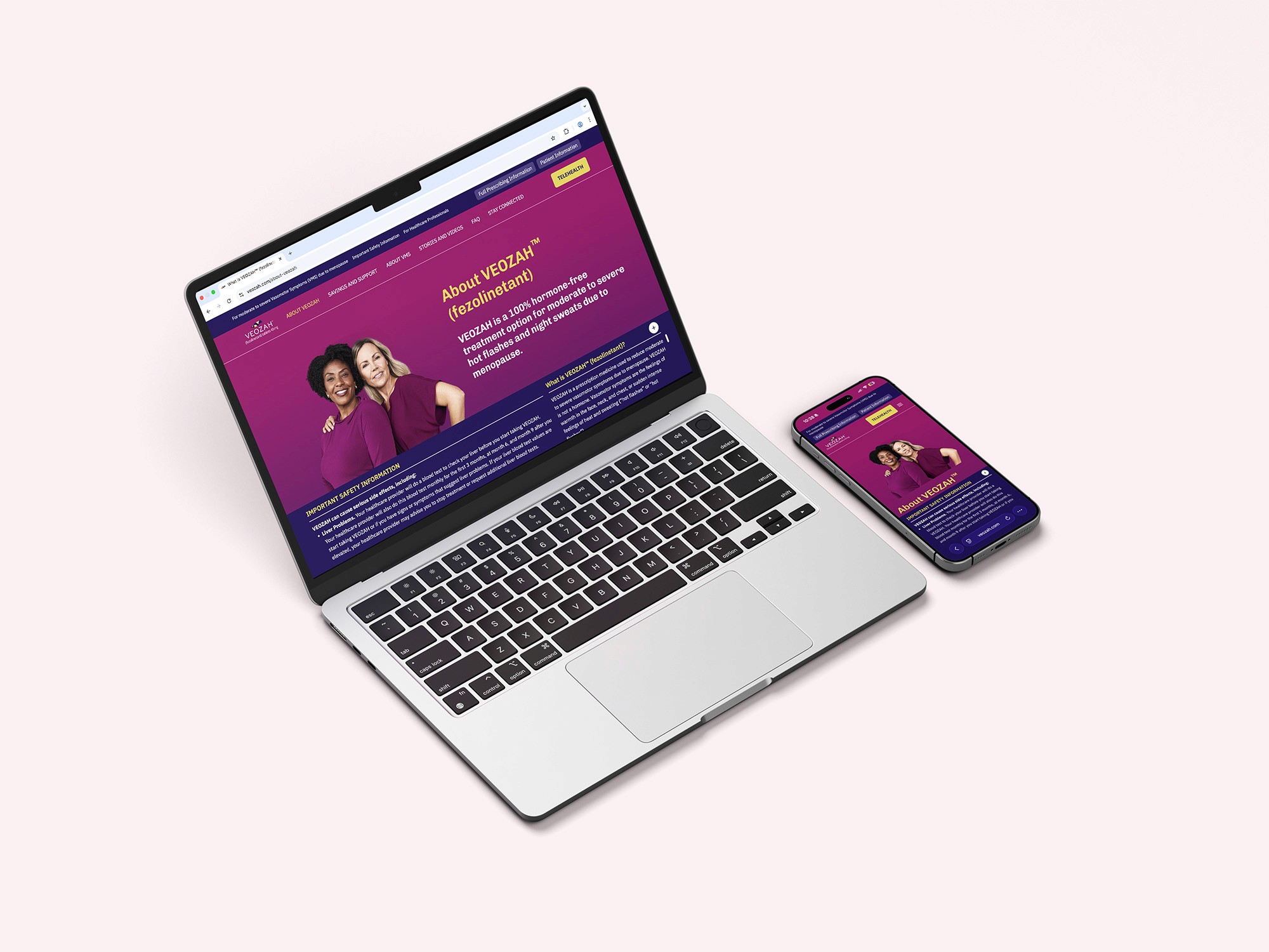
Case 2: DTC Site
Design Direction & Mentorship
Process I lead:
How I Lead the Process:
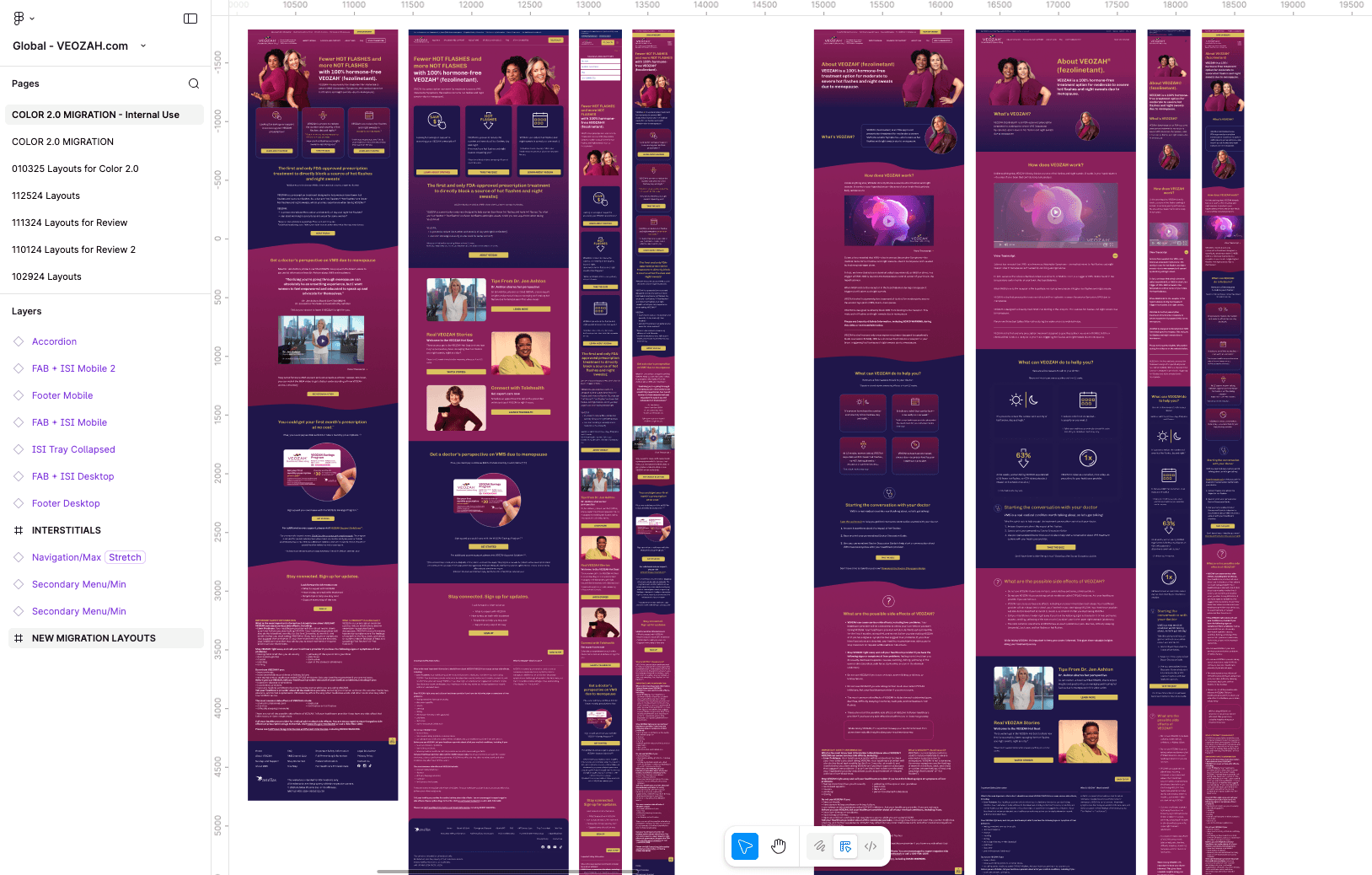
Design Audit & Issue Analysis
I evaluate the existing website to understand structure, components, and design consistency. Identify recurring design errors, deviations from the design system, and incorrect component implementation.
Education & Alignment
I facilitate a dedicated alignment session to explain best practices, correct component usage, and system constraints, ensuring a shared understanding across teams.
Hands-On Mentorship
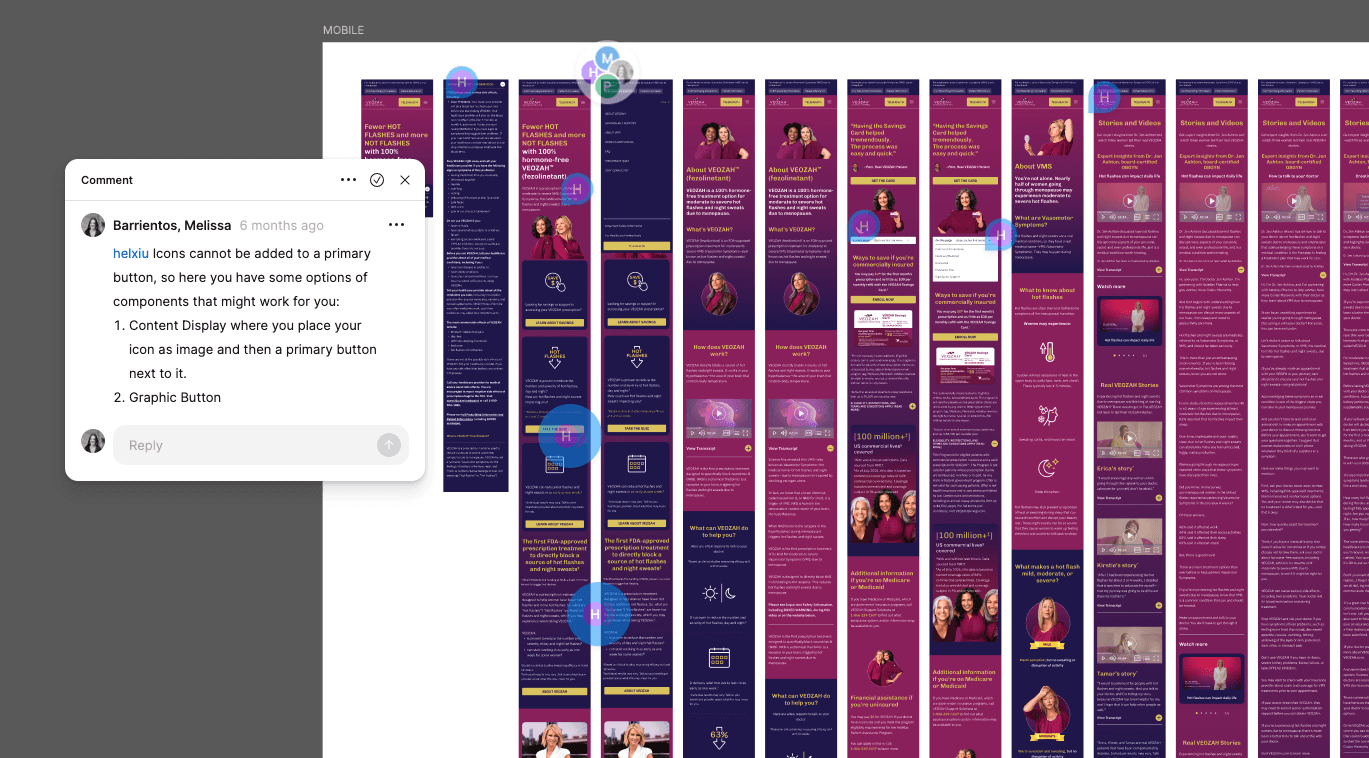
I hold daily 30-minute Q&A sessions with the agency’s design team, providing real-time guidance, answering questions, and reinforcing design standards through collaboration rather than correction.
Ongoing Design Oversight
I conduct periodic design reviews to validate progress, address inconsistencies early, and maintain a high level of quality throughout the process.
Final Validation & Sign-Off
I lead the final design review to ensure the solution was cohesive, compliant, and ready for implementation.
_______________
Case 3: Enhancement of Hero Component
Design System Collaboration
Process:
The Problem
The original Hero component was structurally limited:
Allowed only title, subtitle, body, and footer
Optional image/background
Only two fixed height options
No support for additional layout structures
In real-world implementation, this became a recurring issue:
No space for icons, data highlights, or supporting visuals
No multi-column flexibility
Height restrictions created layout imbalance
Teams relied on workarounds, risking inconsistency
Initial version:


Example and some variations:
My Approach
Identified the issue as a recurring system gap
Documented common use cases and layout needs
Created high-fidelity mockups to illustrate enhancements
Presented UX, scalability, and implementation rationale to the Design System team
The Solution
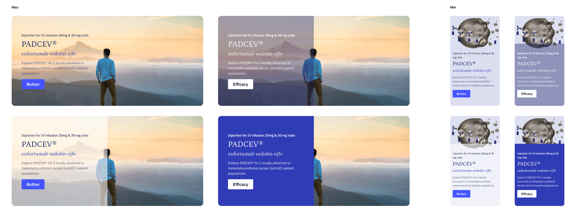
The enhanced Hero now includes:
Three height options: Small, Large, Responsive
Optional content container toggle
Support for icons, images, data highlights, and up to three columns
Enhanced Hero 3: responsive + extended content

The Impact
Eliminated layout workarounds
Improved scalability and flexibility
Maintained compliance and consistency
Now actively adopted across projects
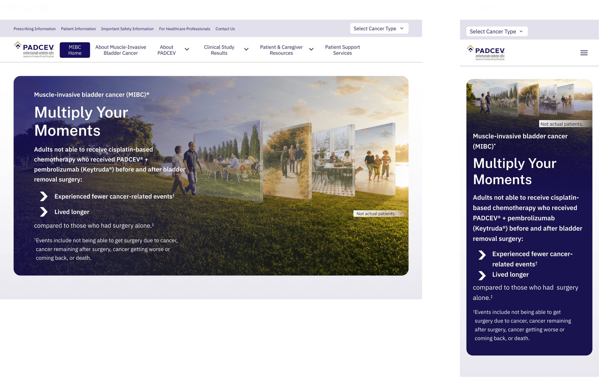
Example of implemented new version:
This example uses the responsive size and the icon bullet content option.
_______________
These projects reflect how I work beyond individual screens, connecting systems, teams, and execution to deliver cohesive digital experiences.
This experience has strengthened my ability to lead through clarity, enable others through guidance, and improve design systems through real-world application.
My Strategic Impact
Reduced implementation costs through scalable design system adoption
Generated substantial business value for global marketing and brand teams
Expanded the design system with reusable components and enhancements
Enabled design teams through hands-on training and ongoing consultation
Accelerated delivery by reducing rework through standardization
Countless dev hours saved by validating compliance before authoring
year
2024-2026
timeframe
4 months / site
tools
Figma | Adobe CC
category
UI/UX

