Cine Magaly Booking Experience
A focused UX/UI enhancement of the cinema ticket booking experience, streamlining the journey from browsing movies to securing tickets on mobile.

the problem
The existing mobile site made it difficult for users to quickly browse movies and showtimes, understand the steps required to buy tickets and navigate the interface without frustration. The information hierarchy was unclear, the layout felt disconnected, and the visual design did not reflect the quality of its in-person experience.
the approach
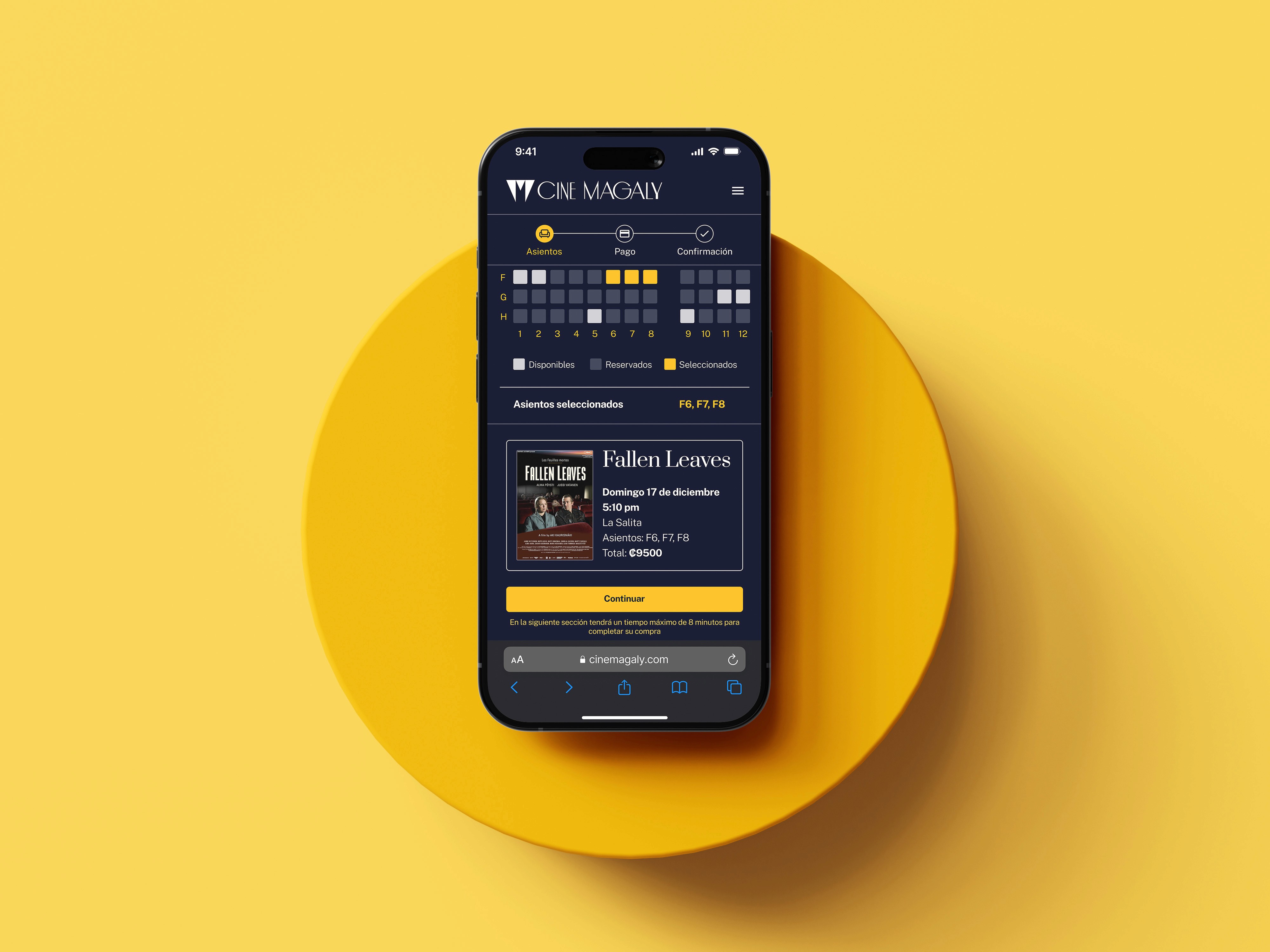
The ticket booking flow was streamlined into clear, logical steps, minimizing confusion and unnecessary friction. At the same time, I refined the visual style to better reflect the cinema’s art-house identity, resulting in a mobile experience that feels both easy to use and true to the brand.
I reimagined the mobile experience for Cine Magaly, a beloved art-house cinema, simplifying how users discover films, check showtimes, and complete ticket purchases.
The Project
This project originated from an internal UX/UI challenge at my studio, designed to showcase our design capabilities. Working within a 3-week timeline and alongside my regular responsibilities, I approached it with a strong focus on prioritization and impact. Although my Figma skills were still evolving at the time, the challenge pushed me to rapidly strengthen my technical execution while delivering a strategic and user-centered solution.
This challenge unfolded in three phases:
A quick walk-through each phase:
Phase 1 — Research & Definition
To better understand user needs and pain points, I conducted lightweight but focused research:

What I Discovered:
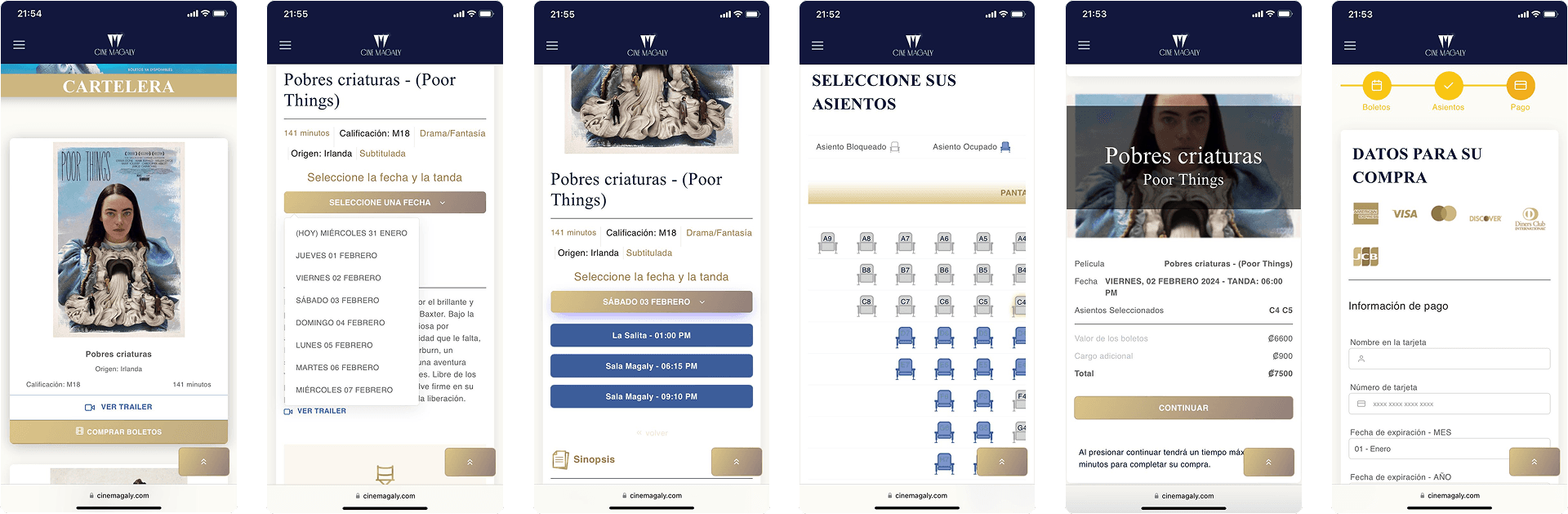
The existing mobile experience suffered from an inconsistent visual identity, weak information hierarchy, and inefficient movie browsing. Key details were incomplete or hard to find, and navigating dates and showtimes felt unnecessarily complicated. Users also wasted time selecting unavailable showtimes, and the overall mobile adaptation created friction instead of supporting quick, confident ticket purchases.
Live Mobile Site:
Information Architecture
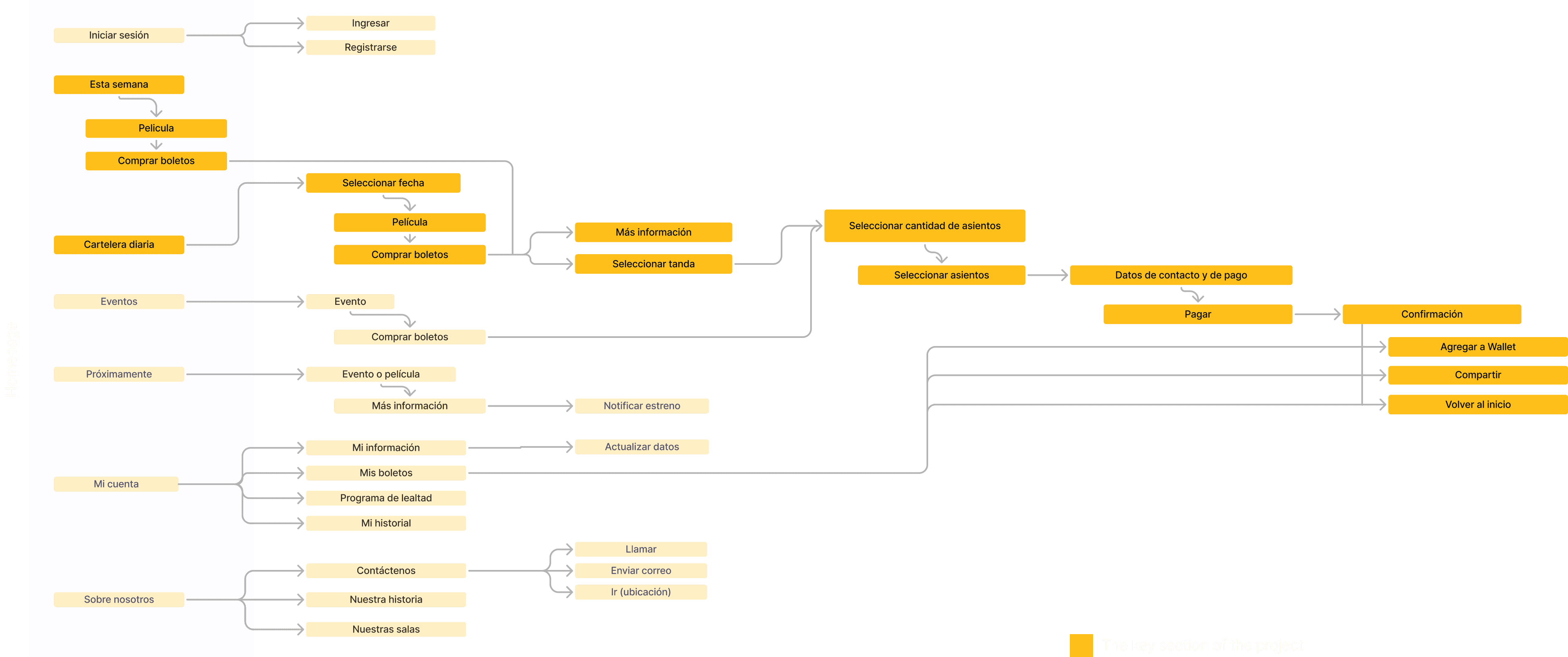
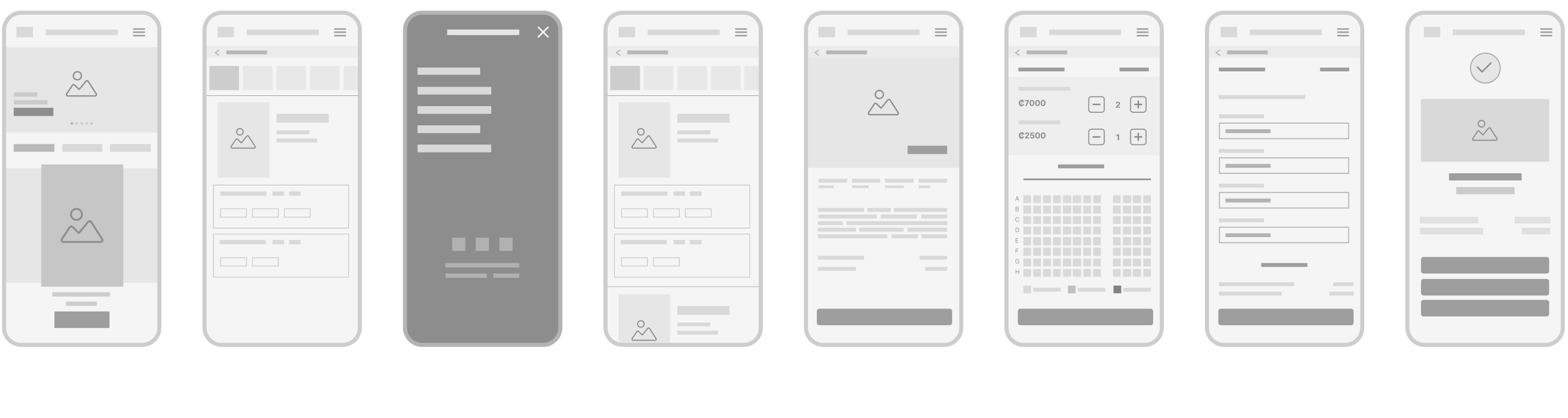
Based on research insights, I focused on simplifying and clarifying the experience. I reorganized the information architecture to prioritize movies and showtimes and streamlined the ticket purchase flow to reduce friction.
Wireframes:
Phase 2 — Interface Design
I updated the style guide to better reflect the cinema’s art-house identity and built a small design system with reusable components for consistency.
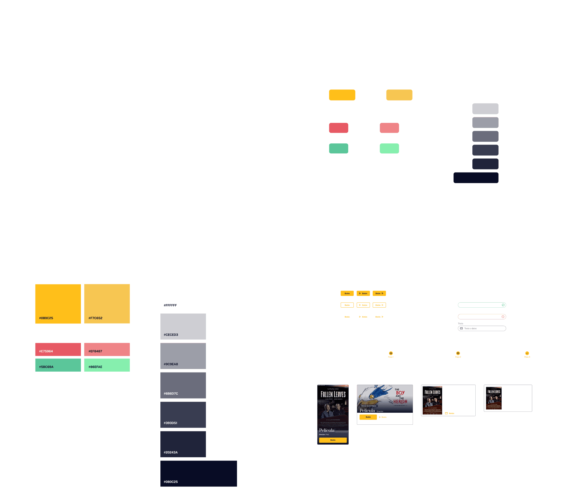
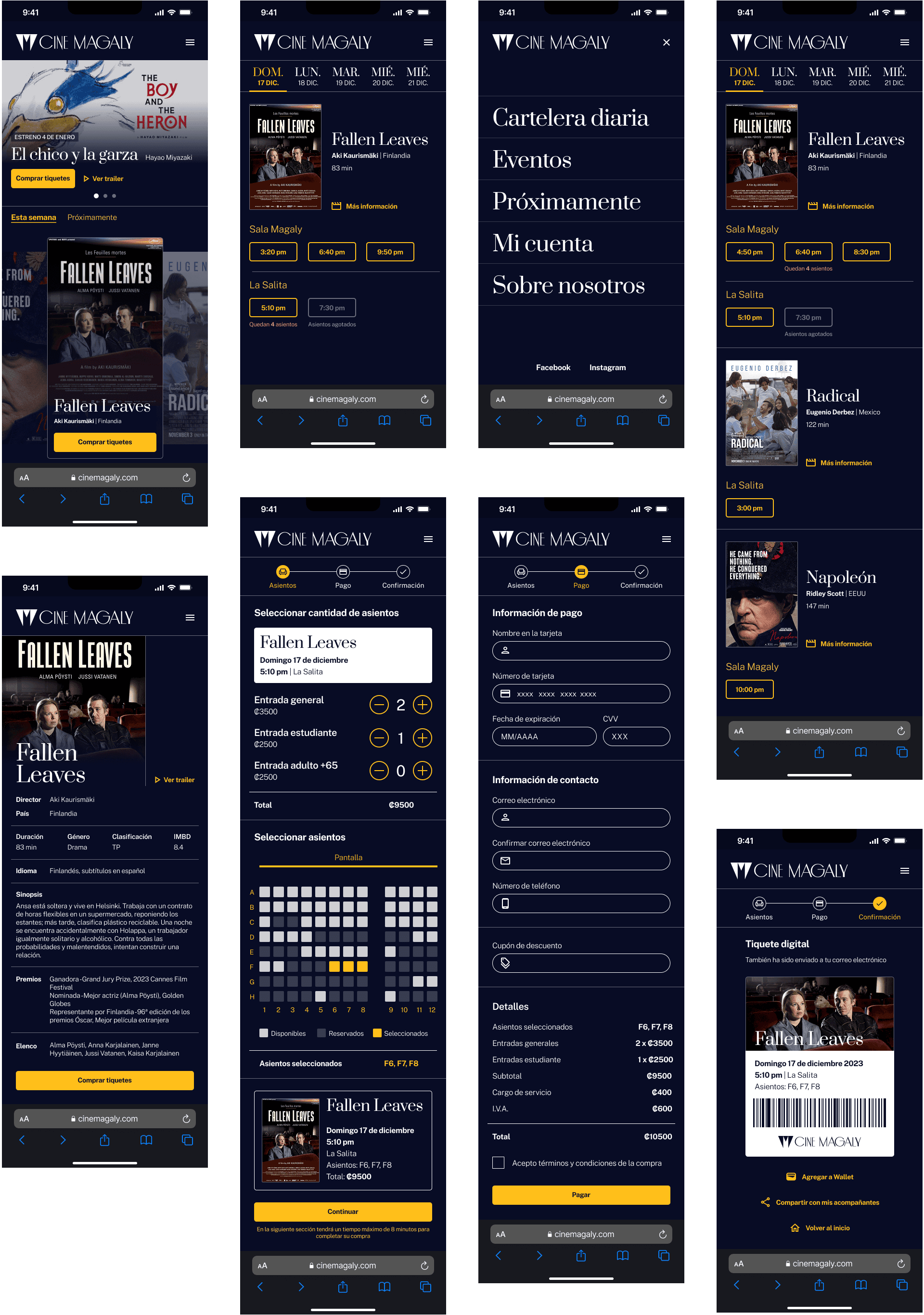
A key design decision was to simplify the content by removing unnecessary information and improving the visual hierarchy to make navigation more intuitive. These choices were driven by user feedback, which pointed to confusion around finding showtimes and key details. The main challenge was striking a balance between clarity and maintaining the cinema’s unique identity and character.
User Interface Proposal:
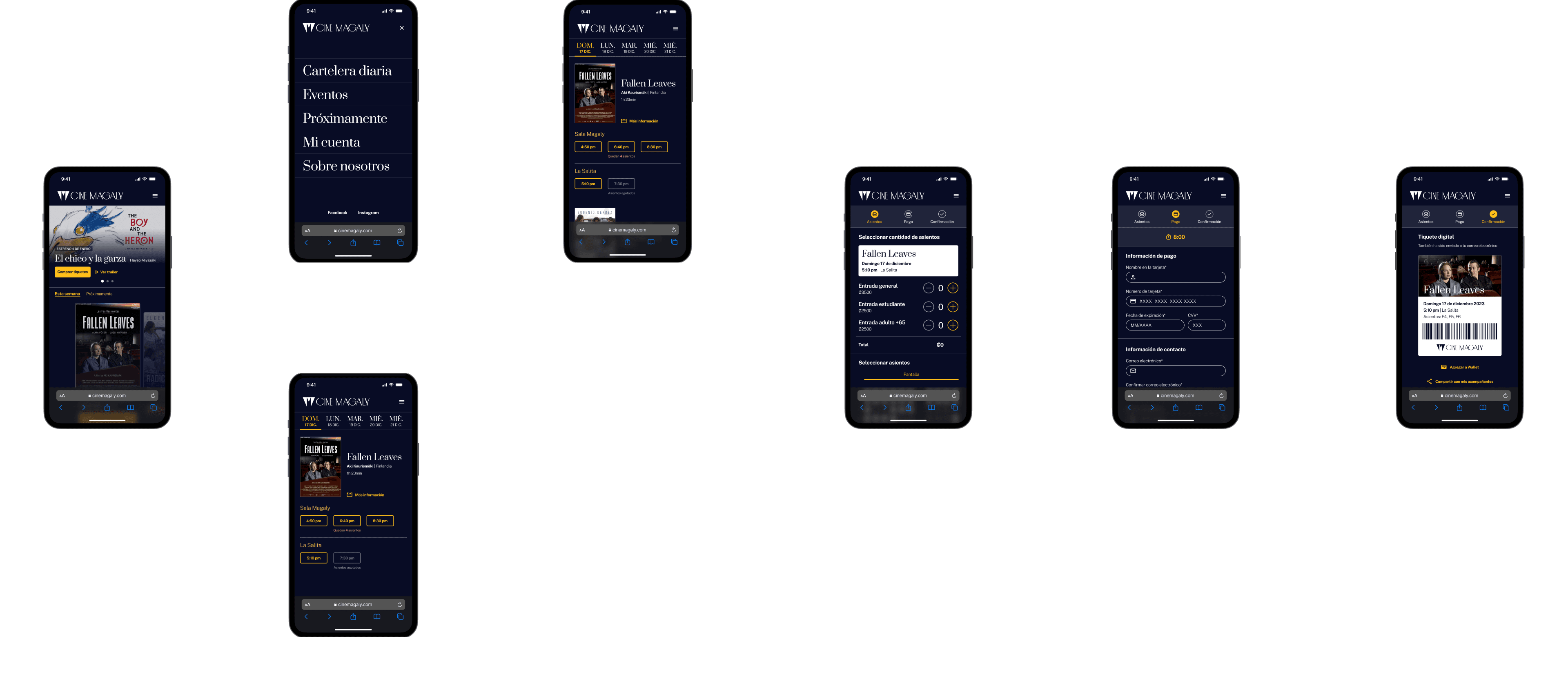
Wireflow:
Phase 3 — Prototype & Testing
The final result was a functional mobile prototype that:
Makes it easy to browse movies and find showtimes
Provides a clear, step-by-step ticket purchase flow
Reflects Cine Magaly’s visual identity in a modern, usable way
____________________
Key Learnings
This project strengthened my ability to:
Prioritize features and scope under time pressure
Turn limited research into actionable design decisions
Rapidly level up my prototyping skills in Figma
Balance usability with brand expression
Working within a short timeline pushed me to focus on what truly matters: reducing friction, guiding decisions, and aligning usability with brand identity. It was a key moment in sharpening both my interaction thinking and my execution in Figma.
year
2023
timeframe
3 weeks
tools
Figma
category
UI/UX


