Clinical Trials Platform Refresh
Transforming an outdated interface into a modern, scalable, and visually-engaging experience built on an existent UX foundation

the problem
As the Clinical Trials platform grew, its interface had become increasingly difficult to navigate and scale. Dense clinical information competed for attention, navigation lacked clear hierarchy, and inconsistent components and visual patterns created friction across the experience. At the same time, the design team was working across legacy Adobe XD files, making collaboration, iteration, and developer handoff more difficult. We saw an opportunity to address these challenges as a product, not simply as a visual redesign.
the approach
As Co-Lead UX/UI Designer, I guided a team of five designers through a structured redesign process, balancing team leadership with hands-on design direction. I helped define the timeline, assign work based on team strengths, and establish weekly reviews for feedback, alignment, and problem-solving. I also shaped the visual direction, guided the development of the design system, and ensured consistency across the experience. When stakeholder feedback called for a more modern UI direction, I led a new visual exploration and designed a high-fidelity concept to validate the direction before scaling it across the platform. Together, we delivered a modern UI, scalable design system, complete page designs, and interactive prototype.
The goal of the clinical trials platform is to help patients and caregivers easily find, understand, and explore clinical trial opportunities. It aims to simplify complex medical information, support informed decision-making, and provide a clear path for users to learn about eligibility and participation.
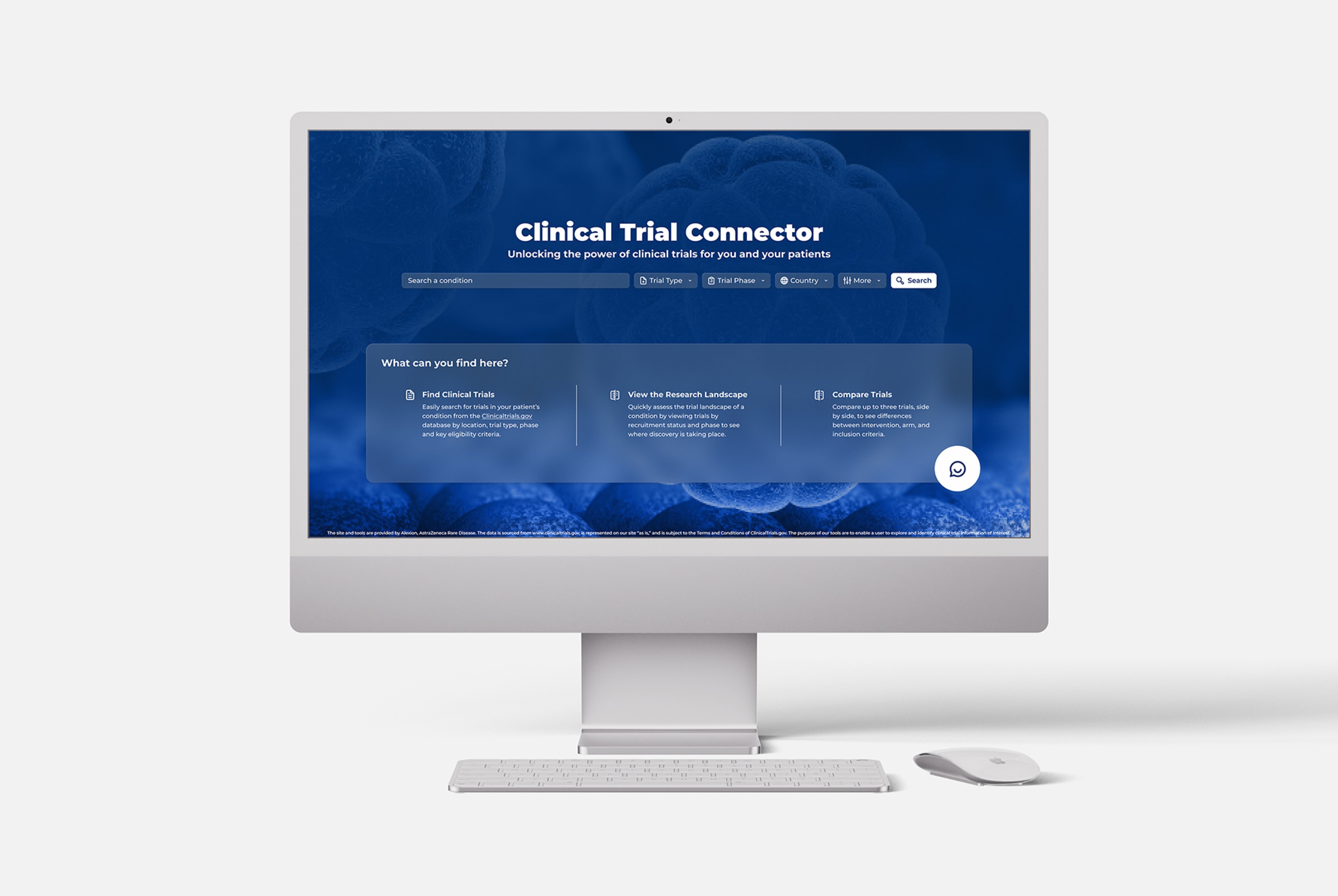
First, some quick context:
What is a Clinical Trial?
A clinical trial is a research study with volunteers that tests whether a new medical treatment is safe and effective before it becomes widely available.
How was this project initially born?
The initial phase of this project was request from one of our clients, a global biopharmaceutical company focused on developing therapies for people with rare diseases. Currently there is an official US government website called clinicaltrials.gov that serves as a platform to search for all kinds of clinical trials, our client wanted to build a clinical trials platform focused on rare diseases with an improved user experience and friendlier interface.
The new phase of the project
I was brought into this project to lead a visual refresh and modernize the overall experience. Beyond improving the interface, the initiative was intentionally designed as a growth opportunity: mentoring junior designers and showcasing the full capabilities of our team. The result was not only a stronger product, but also a strategic piece added to the Studio portfolio to demonstrate our UX/UI expertise.
Now, the project:
What I did & how:
In this project I led discovery, design direction, and system creation from structure to final prototype. I guided heuristic evaluations and competitive analysis, defined timelines and design priorities, shaped the final visual direction, and helped build a scalable design system that improved consistency, usability, and future product growth.
Process
This project was developed through a collaborative design process led by two UX/UI Leads and a team of five junior designers, some of which had no previous experience in UX/UI but wanted to learn and get familiar with this type of projects.
We began by aligning as a team, understanding each team member’s strengths, experience, and areas of growth. Based on this, we defined a clear timeline, distributed responsibilities, and established weekly working sessions to review progress, provide feedback, and unblock challenges. This ensured quality, consistency, and continuous learning throughout the project.
Project Timeline
Week 1 — Foundations
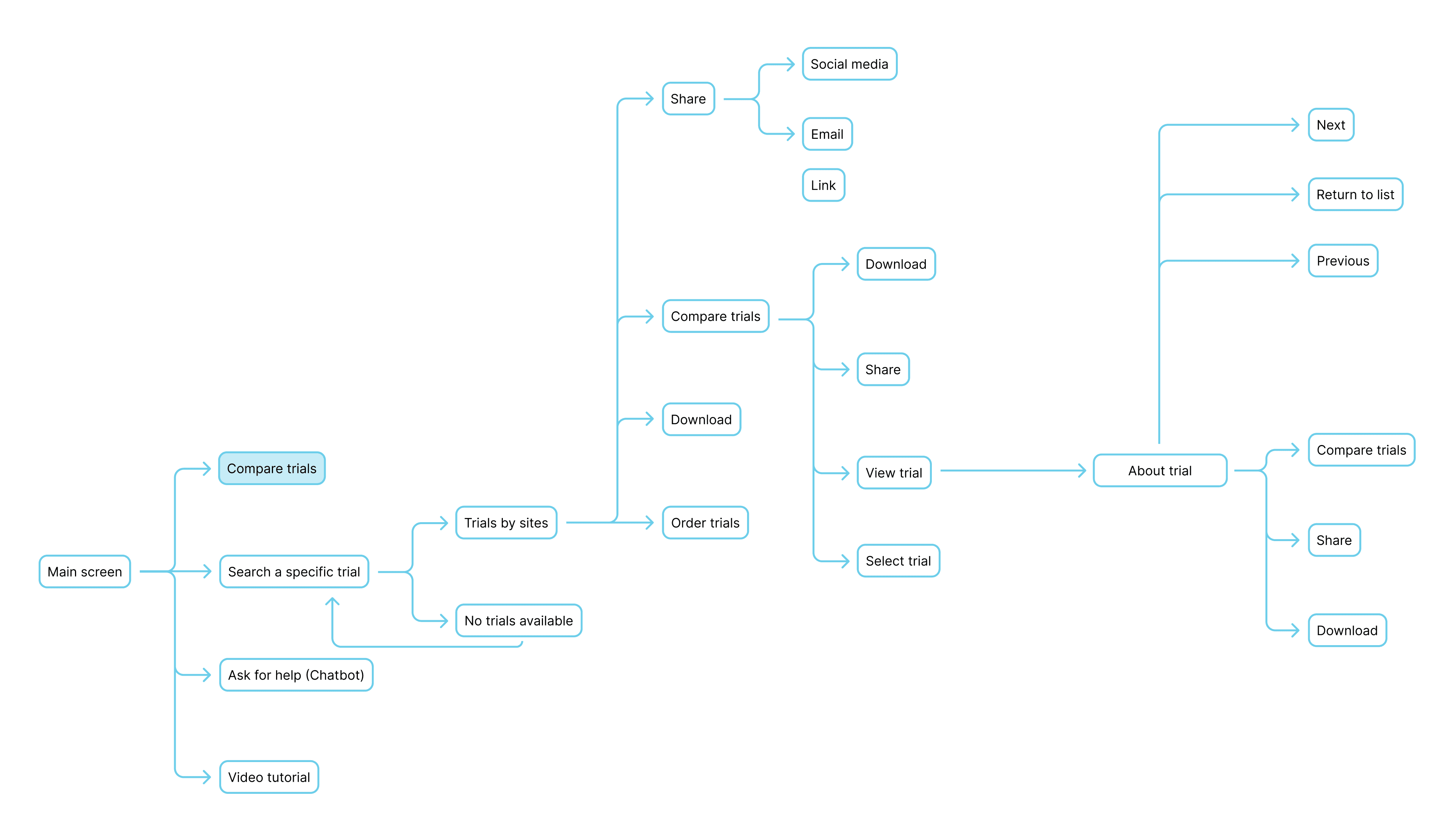
Since direct user access was limited, we took a triangulated approach to understand the existing experience. Four UX/UI designers with healthcare experience assessed the platform against established usability principles, while we also mapped the current user journeys and reviewed competing clinical trial products to uncover opportunities, conventions, and gaps.
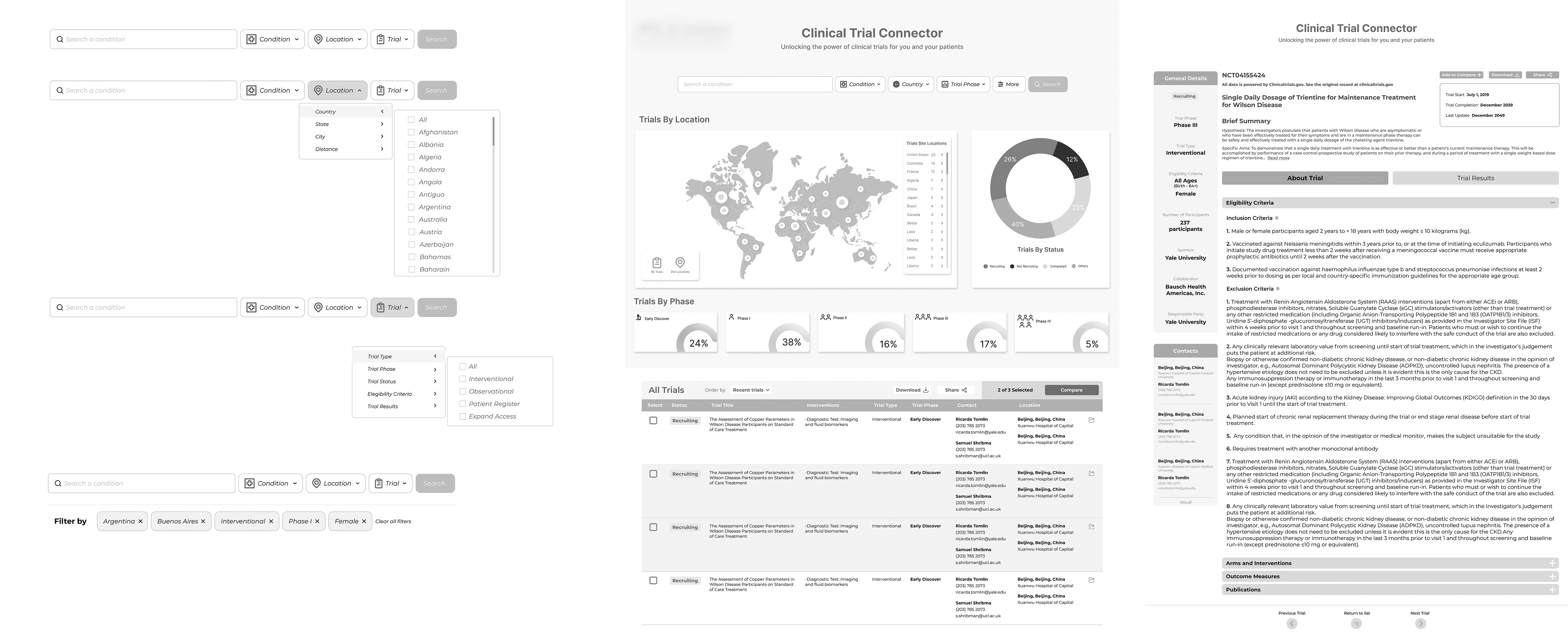
We translated observations into meaningful, evidence-informed UX recommendations and began the creation of low-fidelity wireframes to ensure structural alignment before moving into visual design.
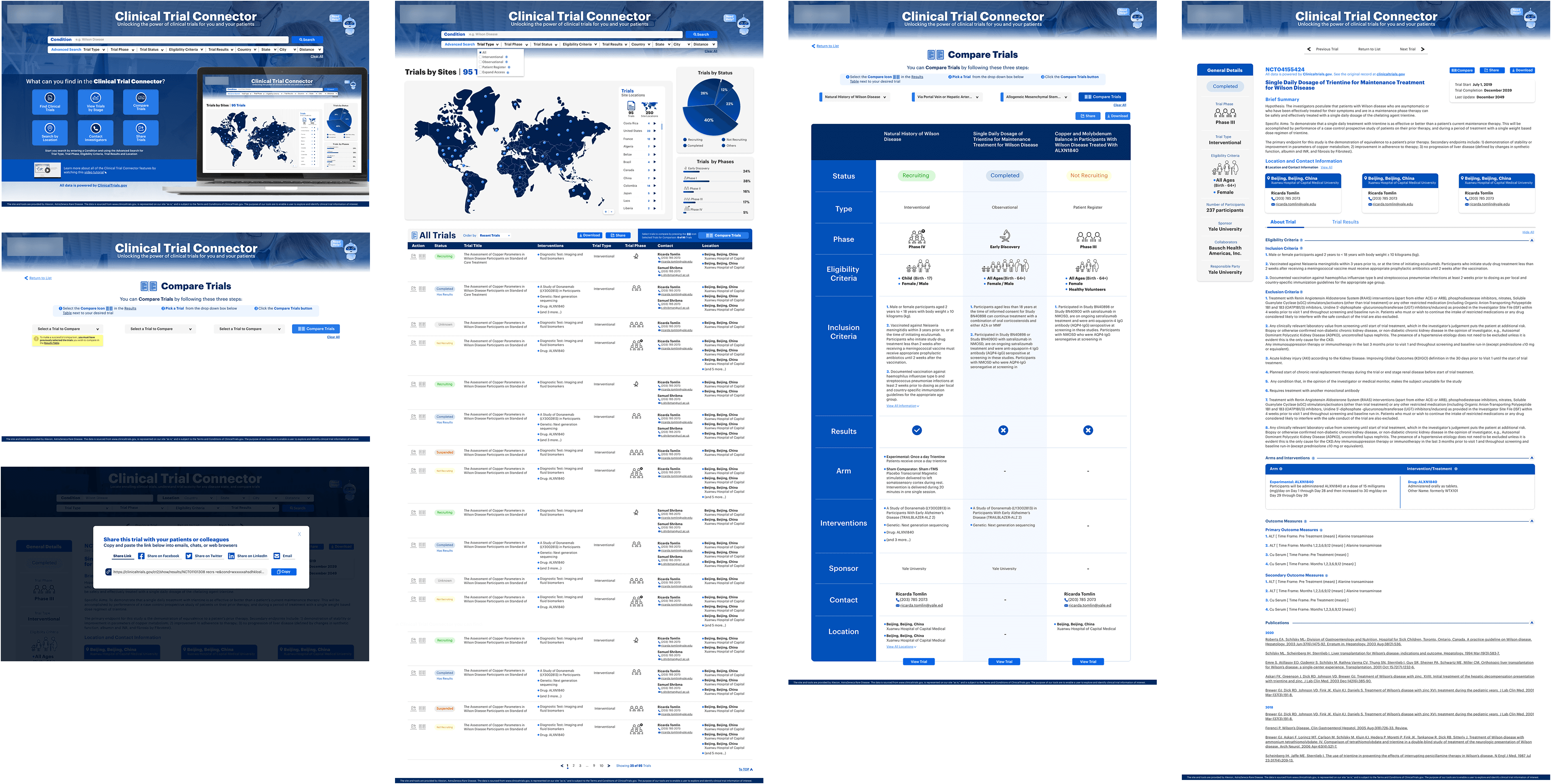
Initial UI:
Information architecture:
Wireframes: search bar exploration and pages layout
Our Strategy
Simplify the experience by refining information architecture and user flows to make clinical trial discovery more intuitive.
Create a cohesive visual language through a scalable, reusable design system and consistent interaction patterns.
Enable better collaboration by establishing a structured Figma workspace with reusable components, styles, and clear design standards.
Weeks 2–3 — Look & Feel Exploration
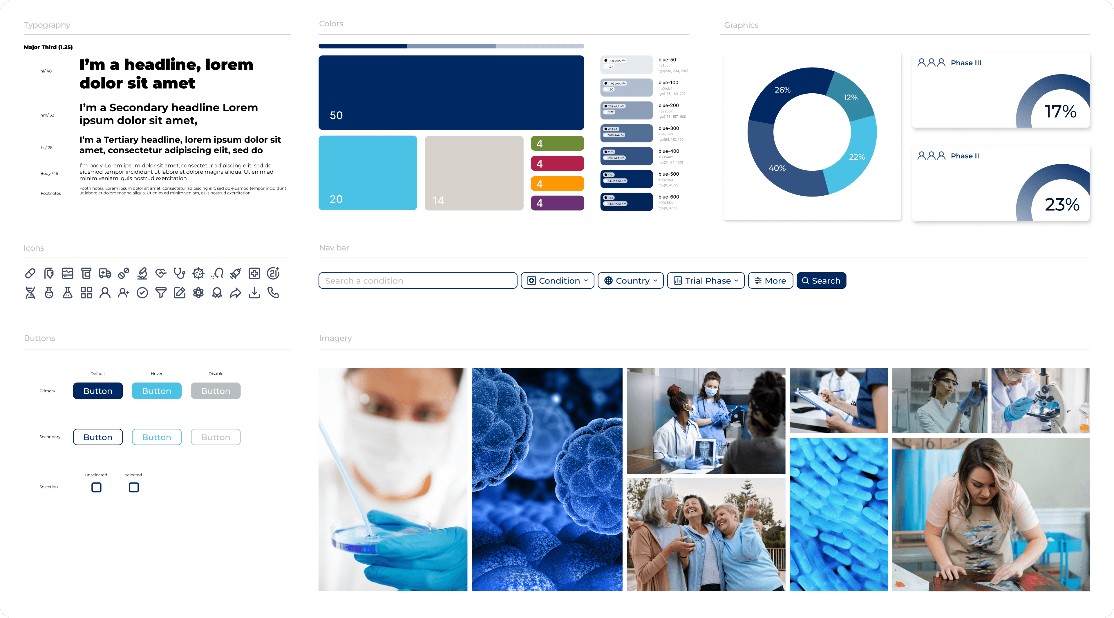
We explored the initial visual direction through moodboards, UI explorations, and a 2-hour collaborative workshop. The goal was to align the interface with the brand’s simpler visual language while improving clarity and hierarchy.
The outcome of this session was the following moodboard/guide that aligned with the current brand guidelines:
Weeks 4–5 — Design System Creation
With a preliminary visual direction in place, we began building the design system, including core components, typography, color styles, and layout patterns.
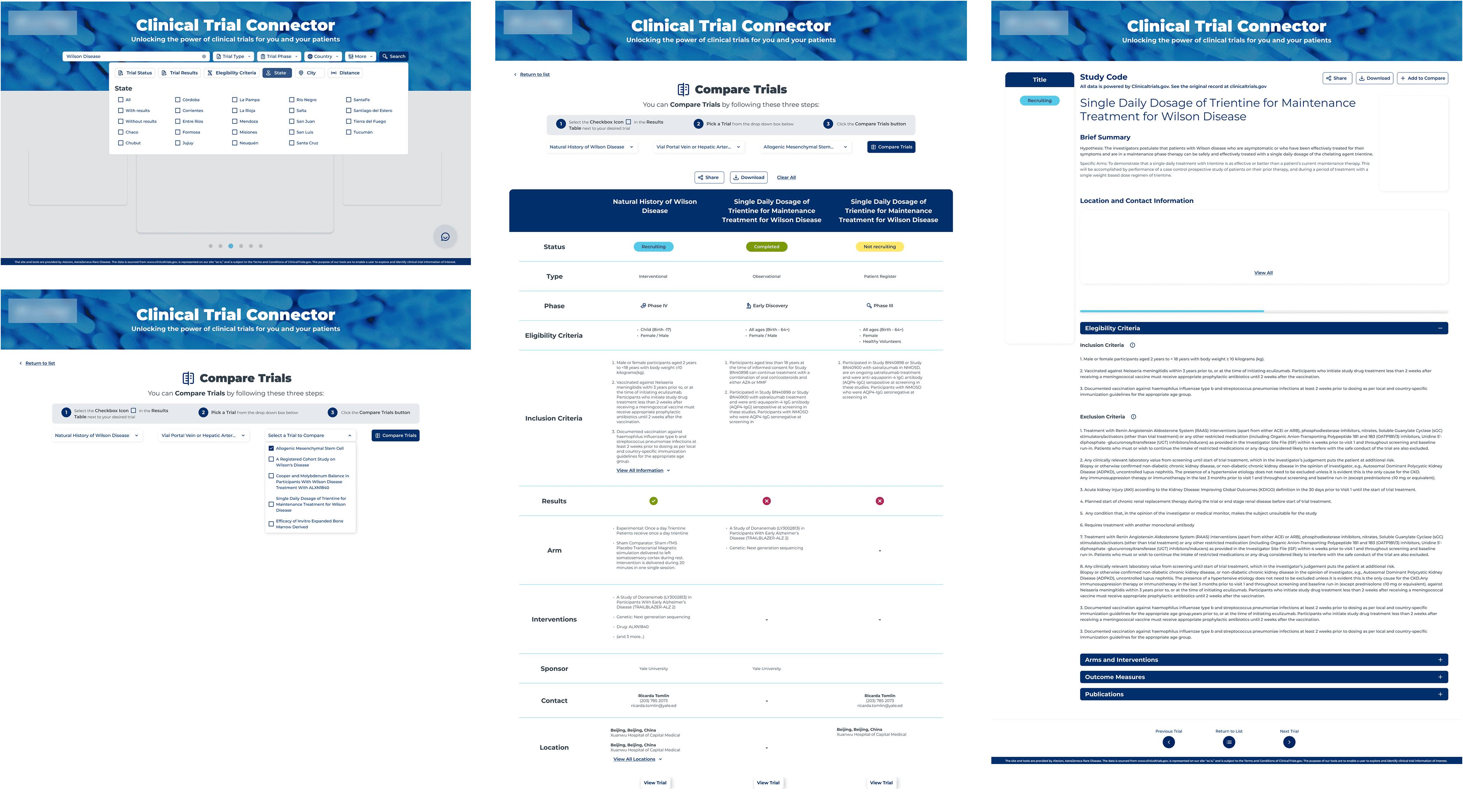
Week 6 — High-Fidelity Wireframes
We applied the system to key pages and created high-fidelity screens.
A Key Turning Point
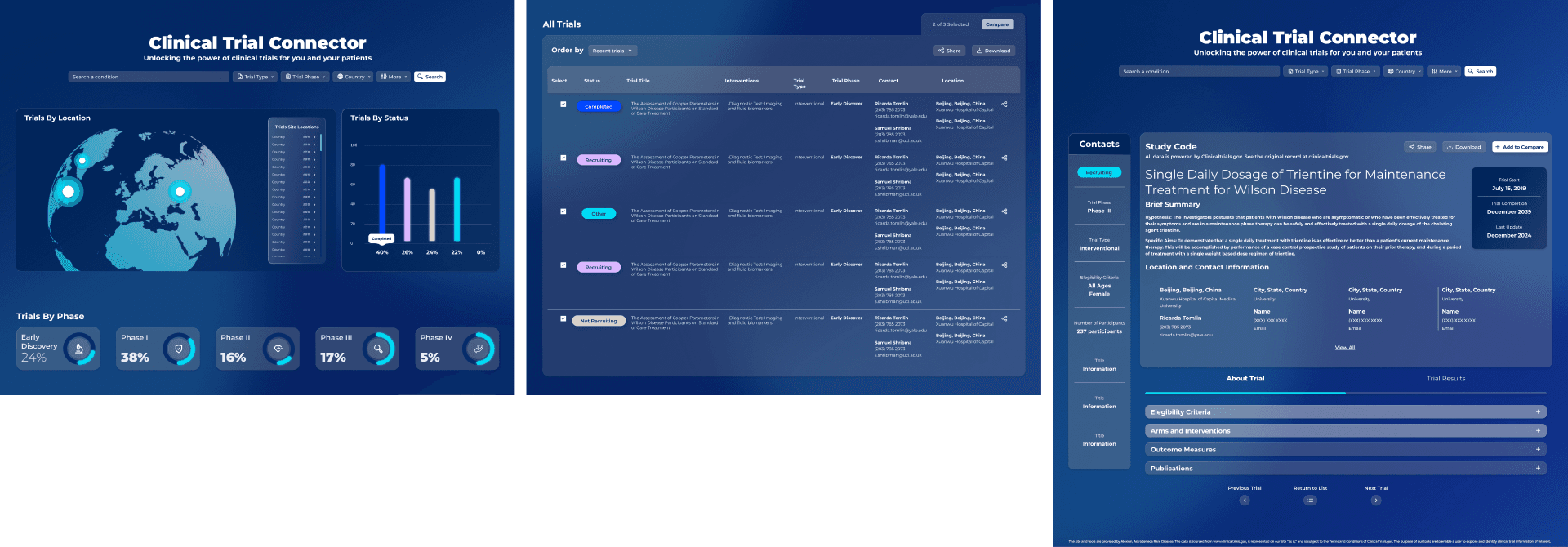
At this stage, the UX Leads had a feedback session with the project supervisor, who suggested us to revisit the look and feel exploration in order to go beyond brand guidelines and come up with a more modern and visually-engaging interface.
The two of us explored new visual directions that introduced a more contemporary style with depth, gradients, and refined visual hierarchy. After presenting a redesigned high-fidelity page, my suggested new direction was approved and became the foundation for updating the entire system and layouts.
This pivot became a key learning moment for the team, reinforcing the importance of flexibility, stakeholder communication, and iterative design.
Look & feel references we used as inspiration for the new UI:

Selected new UI proposal I developed:
Weeks 7–8 — System Refinement & Prototyping
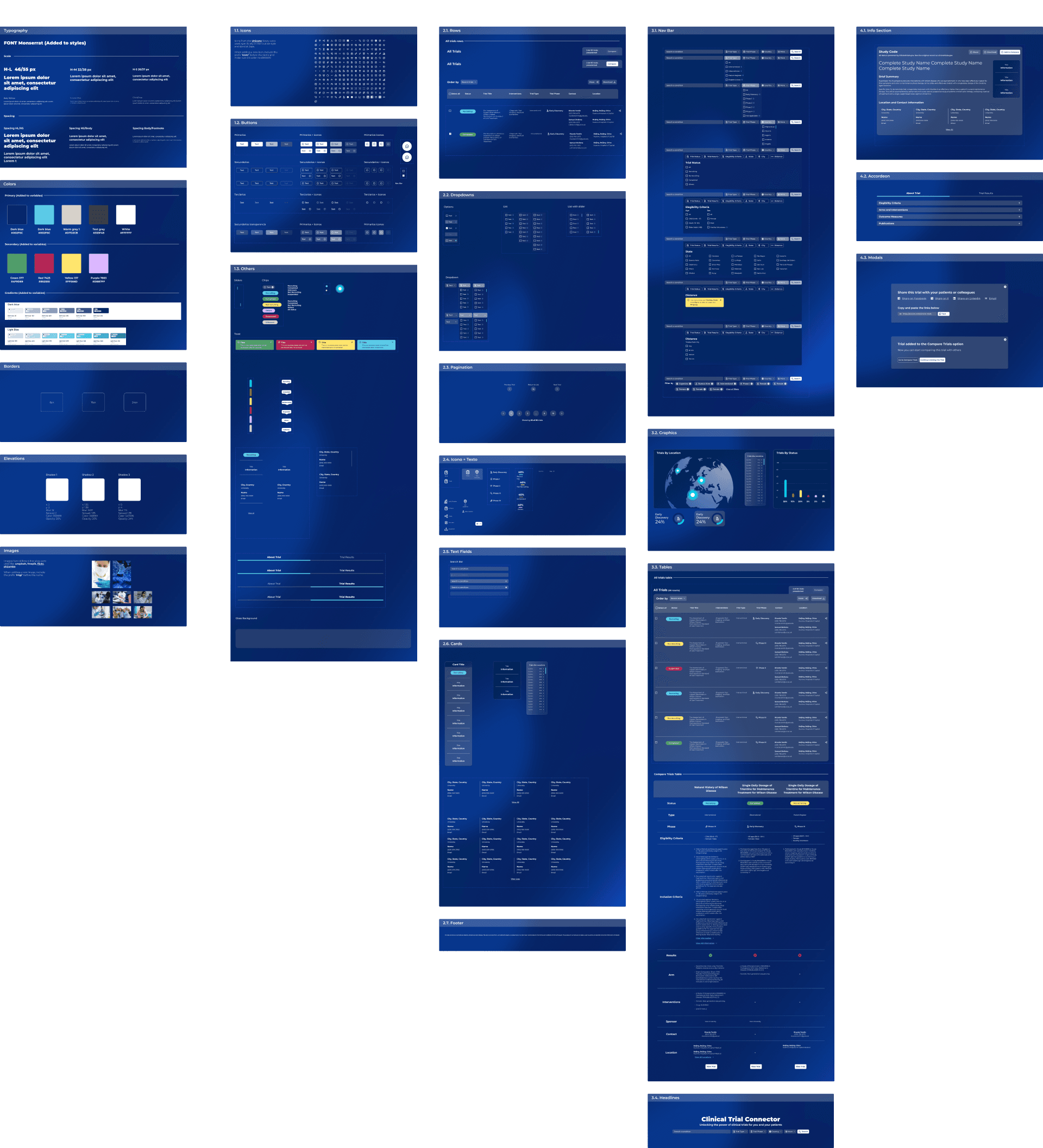
We updated all components and screens to match the new visual direction, refined interactions, and built a high-fidelity prototype to demonstrate the full experience.
Style & Atomic Design System:
Outcomes & Impact
The final result was a modern, visually engaging interface supported by a scalable design system.
The redesign transformed an inconsistent, outdated interface into a clearer and more cohesive product experience, while establishing the foundations needed to scale the platform over time.
A scalable design system that brings consistency across the product and supports future growth.
Clearer information hierarchy that makes complex clinical content easier to scan and understand.
More intuitive navigation that helps users find relevant information and complete key tasks with greater clarity.
A modern visual language that gives the platform a stronger, more engaging product identity.
A stronger design workflow that enabled six designers to collaborate consistently through shared components, standards, and feedback.
The final experience was brought together in a high-fidelity interactive prototype, ready to validate key user journeys, navigation, and task completion through usability testing.
Team members:
Interaction Design Leads: Melissa Barrientos & María del Mar Vargas
UX/UI designers: Jean Carlo Arroyo, Anthony Morera, Angelica Ríos, Elena Saborío, Rosmery Valle
year
2025
timeframe
8 weeks
tools
Figma
category
UI/UX


